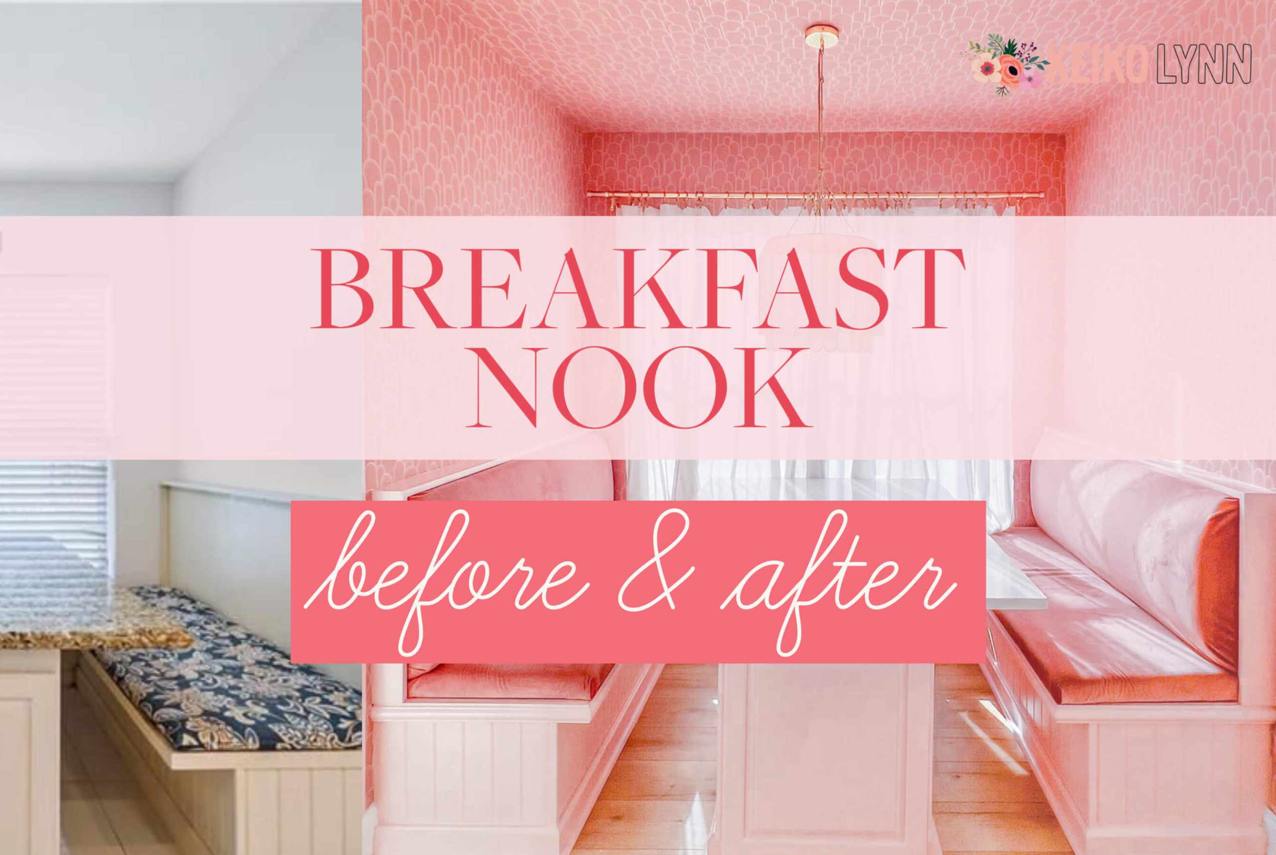

Our Built In Breakfast Nook with Storage Benches
Upon moving into our 90s suburban home, there was one space that I was particularly excited about transforming: the built in breakfast nook with storage benches. Our house traded excess storage for lofty ceilings, which is great for light and airiness but not so great for people who have a lot of photo equipment and scarce places to store them.
It seems as though the previous owners attempted to tackle that issue on their own, by turning the kitchen nook — that [perhaps] once housed a free-standing table — into a built in breakfast nook, complete with storage benches. There were some design issues and things I would have done differently, but it felt like a great place to start. I took one look at it and had a vision of how to transform it with some simple tweaks. Keep reading for the design process and details on how I transformed a traditional, dated, built in breakfast nook into a dimensional pink dream.
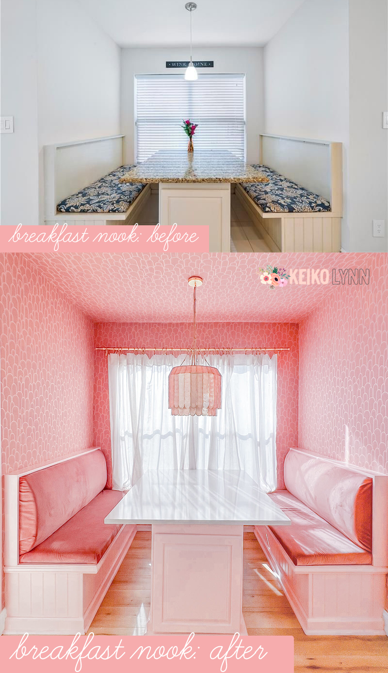
Our Built In Breakfast Nook with Storage Benches
But first, what is a breakfast nook?
A breakfast nook is essentially just a small dining area (usually off of or in the kitchen) that’s less formal and a little more cozy than a traditional dining area. They often, but not always, utilize built in benches or booths in smaller spaces and are a great place for casual meals.
What’s the benefit of having a built in breakfast nook ?
If you’re like me and sometimes have a difficult time figuring out layouts and how to utilize space properly, a built in breakfast nook takes that issue away. Anything built in also has that custom, original details look…which is hard to come by in a typical 90s home. In our case, it also has storage benches and storage in the base of the table, making it very useful. It just needed a little update.
Are breakfast nooks outdated?
Overall, I don’t think so! It’s such a broad category and can be designed with myriad styles of tables, seating, and decor. In our case, our built in breakfast nook was outdated — which is why I decided to give it a makeover. I’ll walk you through my process of revamping our breakfast nook.
Phase one: Assessing the existing situation
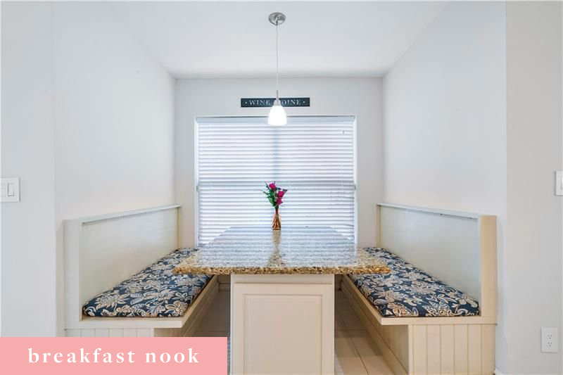
Some of the best advice I received from a fellow homeowner and blogger (thanks, Kelly!) was to live in the space for awhile before making any hasty decisions. I already knew what design elements I wanted to add to this breakfast nook, but there was one thing I wouldn’t have thought to change if I started right away without assessing the existing situation and living with it for awhile. The problem? There was no leg room. It was awkward to get in and out of the booth, because the built in storage benches were a little too deep and the counter was a bit too wide.
Phase two: Planning the changes of our Built In Breakfast Nook
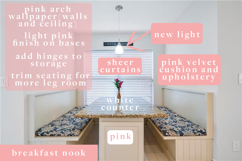
My next step in redesigning our built in breakfast nook was to lay out the changes in detail. I like to do this visually, so I usually make notes on the before photo, almost like a visual checklist. The only change in here that we didn’t keep was adding hinges to the storage, because the design made it too cumbersome. Looking back, it might have been a good idea to rip it out and start from scratch, but we are on a budget and felt that the “bones” of this were good enough to work with. It could have been utilized a little better, but there’s sufficient storage in the table base and benches.
With the list of design changes in place, I moved onto the fun part: the design and decor phase!
Phase 3: Designing the Decor of Our Built in Breakfast Nook
The decor design phase is always my favorite. Planning layouts and renovation details are not my forte (hence, consulting with professionals on the living room and kitchen renovations), but making things look lovely is well within my wheelhouse.
Surprise, surprise: the color I decided on was pink. I knew I wanted an art deco inspired, pink wallpaper, so I ordered some samples from Wallpaper from the 70s:
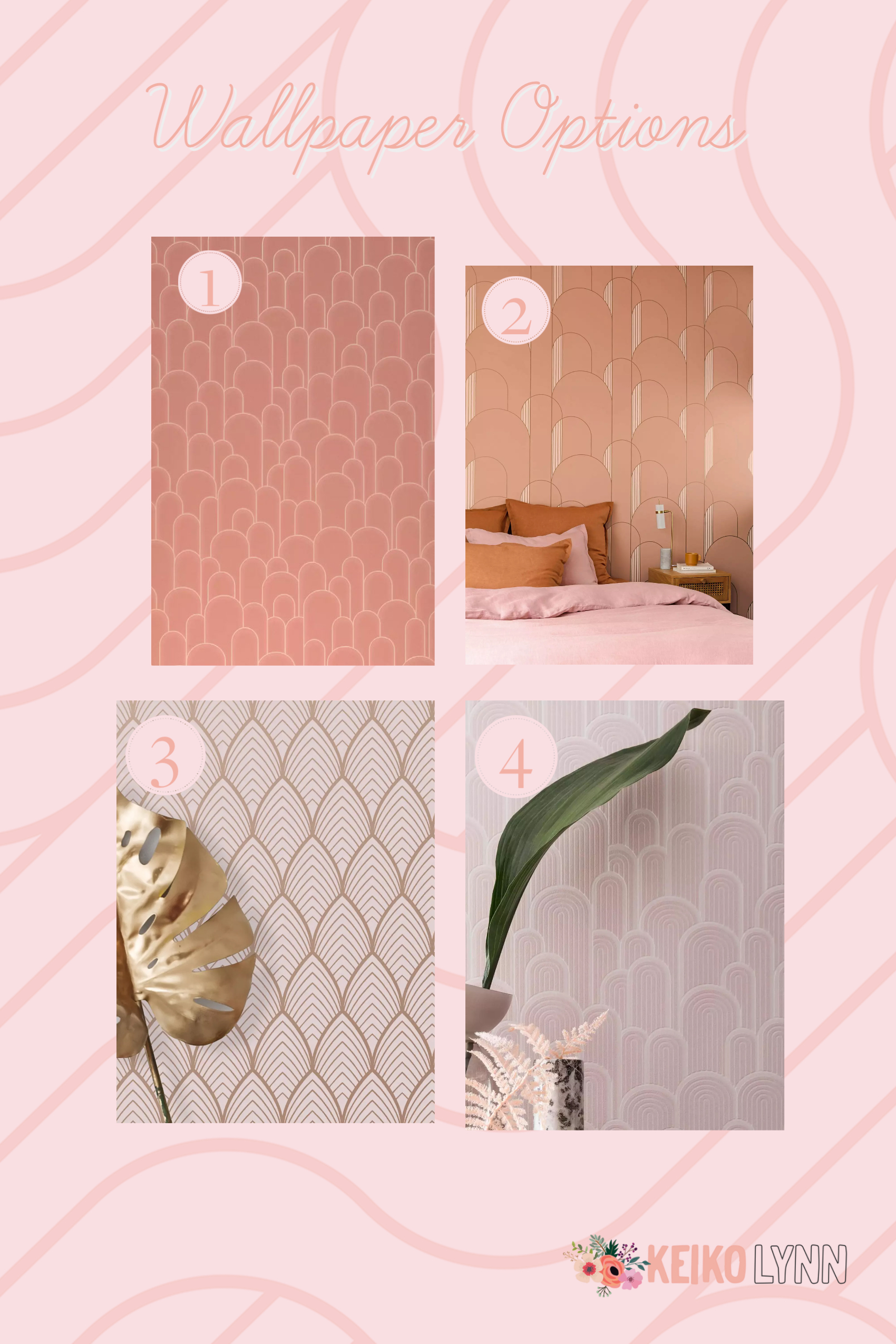
Hot tip: Order samples before committing to wallpaper. The extra bit of cost and time is worth it! It makes a big difference to see it in person, in its intended space. I was almost certain the 2nd paper (Gordon Rosewood) or the 4th (which is no longer sold!) would be my pick. But the 1st one, Fabius Rosewood, brought to warmth and depth to the otherwise blank and slightly flat breakfast nook.
Numbers 1 and 4 had a unique texture, and I love a monochrome theme with varied textures. Number 2 would be gorgeous in a larger room, but the scale was wrong for such a small space. And number 3 was too shiny and paper-y for my liking. With my main design detail chosen, the job just got easier: finding the right paint match and fun details.
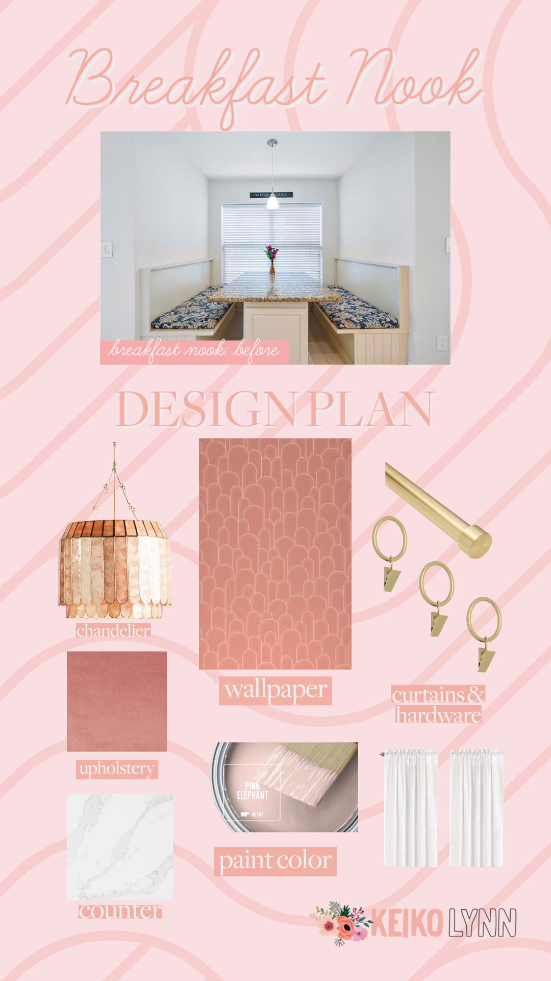
The Design Details of our Built In Breakfast Nook
Countertop
This happened at the same time as two higher priced renovations, despite having a lower budget. In addition to a full kitchen renovation, we were simultaneously having new floors put in. Since we were getting new, Calacatta Gold quartz Silestone countertops in the kitchen, I added on the the breakfast nook’s counter space. It’s just off the open kitchen, so having a matching counter made it feel much more cohesive. For the record, I love the Calacatta Gold quartz. It’s simple and clean and a little softer than the ones with bolder veins, and cleans up very easily. The counter is ever so slightly smaller, making it easier to slide out of the booth.
Paint Color
The paint color was an easy choice. We took our wallpaper sample in for a color match (of the lighter lines in the textured paper) and went with Pink Elephant from Behr. The breakfast nook’s booth and storage benches are sealed with polyurethane for longer durability.
New Seats and Upholstery
I’m not sure if the original owners had seat cushions that they removed, but there were only removable outdoor cushions. My brother in law made new cushions for us using wood, foam cushions, and a bolt of pink velvet. As per my plans, he cut down the seats for more leg room. I love the contrast of the velvet with the glossy countertops — I’m all about mixing textures.
Curtains and Hardware
It was really important to me to retain the natural light that comes through this window. With the Calacatta Gold quartz countertops, I felt like white linen could be a decent, if temporary solution. To be honest, I’m not sure exactly how I feel about the stark white with the otherwise almost monochromatic look. Maybe one day I’ll find a replacement or dye them.
However, for the time being, these linen curtains are great for letting light in while maintaining privacy. I am pretty sure Elsie is originally the person who recommended these as an inexpensive curtain option. Curtains can be incredibly pricey, and these are really nice for the price! We installed this gold curtain rod and used these gold curtain ring clips.
Lighting
My splurge was the icing on the cake: our Madelyn Capiz Faceted Pendant. As soon as I picked out the wallpaper, I knew I wanted this chandelier. I love how it mimics the arches, ties in the gold hardware, and adds extra dimension with its shell-like quality. Keep in mind that shipping may take awhile. It also comes in multiple sizes and styles, as well as another color (ours is the first one, in pink):
The Final Result of our Built In Breakfast Nook
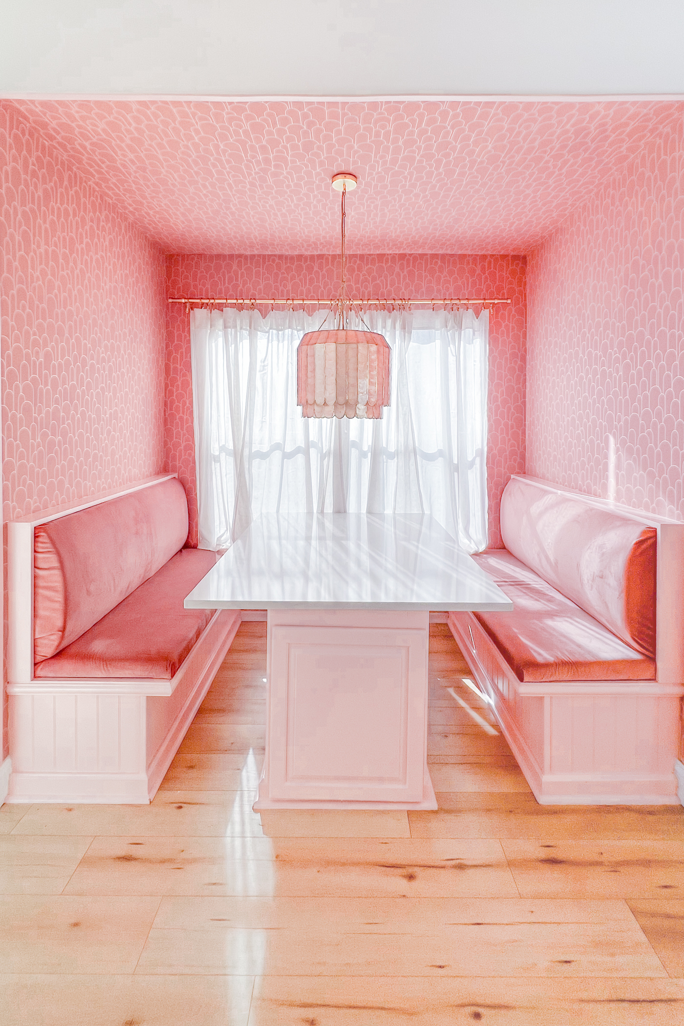
Since my planned home office became more of a photography storage before I even began decorating (oops!), I find myself working from our breakfast nook pretty often. I am more than happy working from our built in breakfast nook, until my office is finished. In fact, I’m sitting here while I write this post! The cushions are comfy and provide nice back support, and the shades of pink are a major mood lifter. It’s a great place to enjoy a cup of coffee and a meal, and also the cutest “office” I’ve ever had the pleasure of working from.
I hope this gave you some breakfast nook ideas! For more unique home decor inspiration, check out my pink kitchen makeover, budget dresser DIY transformation, gallery wall how-to, pink and green living room decor, pastel bohemian home office, pastel patio makeover, and Bobby’s home office makeover.
Shop This Post


